

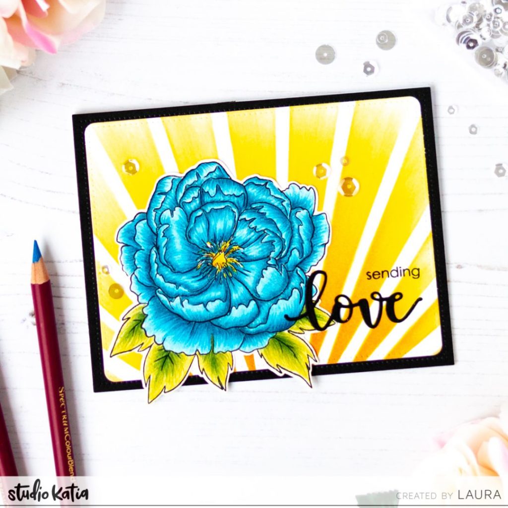
Hi everyone! Today I am back with a card created with the beautiful Studio Katia Japanese Peonie stamp set. There is a video too at the end of this post, where I share all the details of the card making process – I hope you’ll find it helpful!

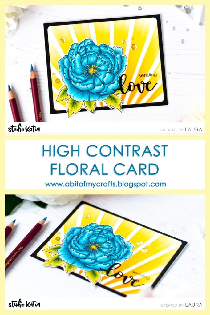
The image I used today is part of the Japanese Peonie stamp set, was colored with Spectrum Noir ColourBlend pencils and die cut with the coordinating dies.
I glued it over a background created with Distress Inks and the Underwater Sun Light Rays stencil. I used contrasting colors to the ones I chose for the peonie, in order to drive make the flower stand out.
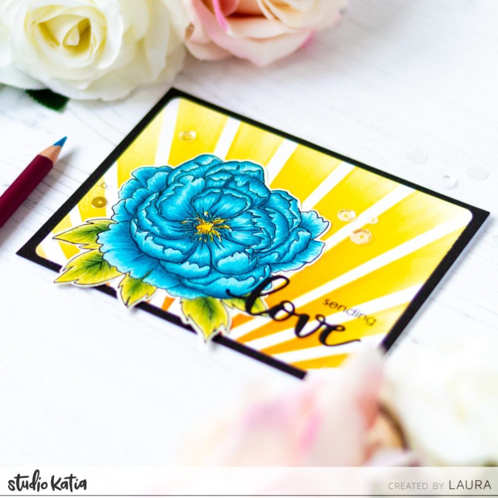
The stenciled background was cut with the Dotted Patterns, Set 3 dies and glued over some black cardstock, that I had previously die cut with the Darling Ribbon & Frames dies.
For the sentiment, I die cut some black cardstock with the coordinating dies to the Spring Bouquet stamp set. I also stamped the word sending from the Japanese Peonie set.
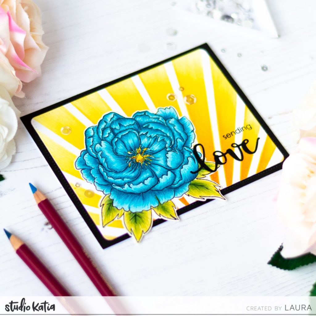
As a final step, I embellished the the card with some sequins from the Majestic mix.
And here is the video for you, showing you how to create this floral card with the beautiful Japanese Peonie stamp set. If you like it and you haven’t already, you can subscribe for more inspiration! And if you’d like to support my channel, you can share the video with your crafty friends! Thank you very much!


Comments
thank you for the detailed video
Very helpful video, gorgeous card design x