

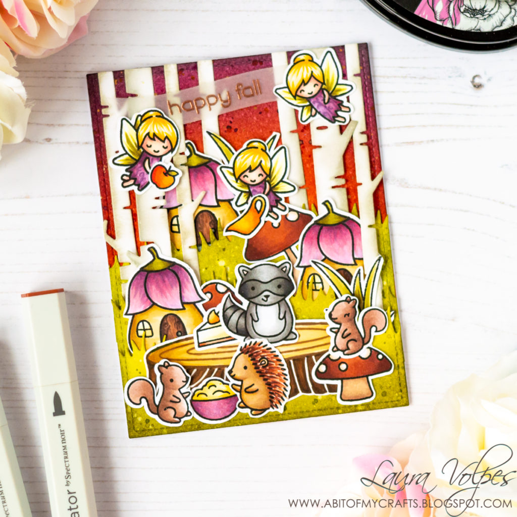
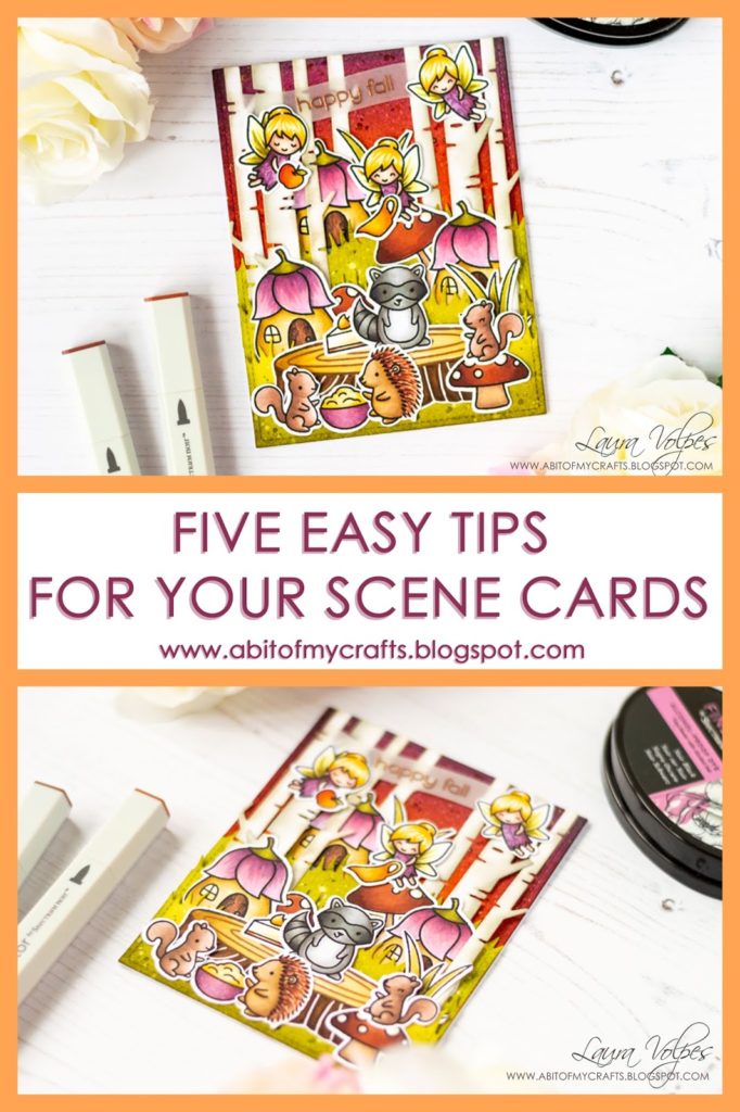
Hi everyone! It’s been such a long time since I last joined a cardmaking challenge, and I am so happy I managed to carve some time to get back in the game…plus, when I saw the prompt for the Lawn Fawnatics challenge I knew I had to play along! I paired it with the Simon Says Stamp Instagram challenge and I created this very intricate scene card, which was SO fun to make and turned out pretty cute, don’t you think? 🙂
I also thought it would be nice to create a post where I share some tips on creating scenes on you cards. These are my favorite cards to make and I think that by following a few simple tricks you can create some stunning scenes too!

Ready? Here they are:
Five easy tips to create stunning scene cards
1) Choose a limited color palette
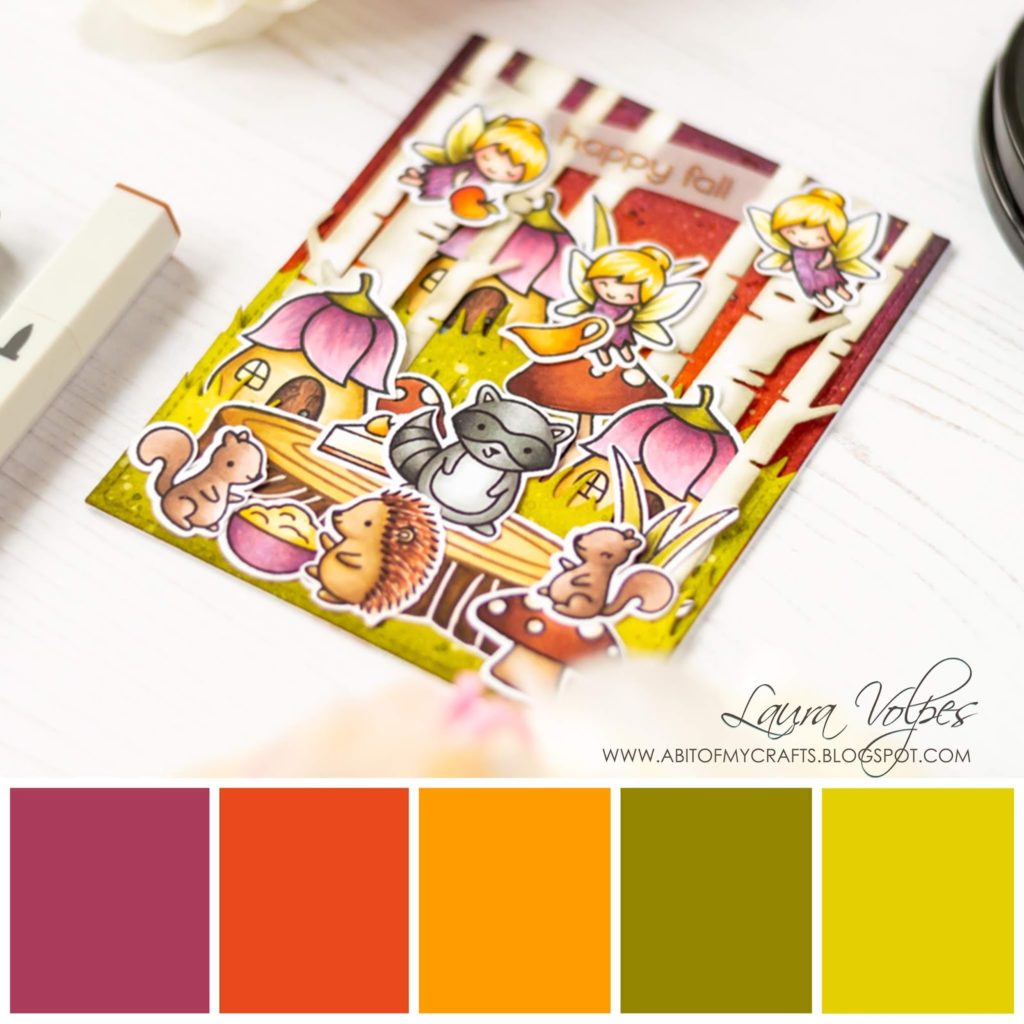
I love a nice and busy scene card, but the risk of it just ending up looking messy gets higher the more elements you add. One way to mitigate the risk is to choose a limited color scheme, especially if you use bright colors (three to five should do. I use seven only if I go for a rainbow palette).
If you use muted colors it is generally safer to expand your palette a little, and you can always to throw in some extra neutrals (browns and greys).
For this card I used five colors, and I started creating the background first. This defined my color scheme and it was then easier to pick markers for my images afterwards.
For the sky I used Distress Inks in Seedless Preserves, Fired Brick and Wild Honey and for the Grass I used Forest Moss, Peeled Paint and Crushed Olive. The images were colored with Illustrator Markers.
And if you need color inspiration, make sure to follow my Color Palette board on Pinterest – there I share some exclusive color schemes inspired to my cards. You won’t find that content on any other of my social media platforms!
2) Work with visual triangles

Visual triangles basically means that you will be able to draw an invisible triangle between elements in your scene. I am not sure exactly why, but our brains like triangles. They guide our eyes across the piece, even a busy one like this, in an orderly manner. Triangles make us happy.
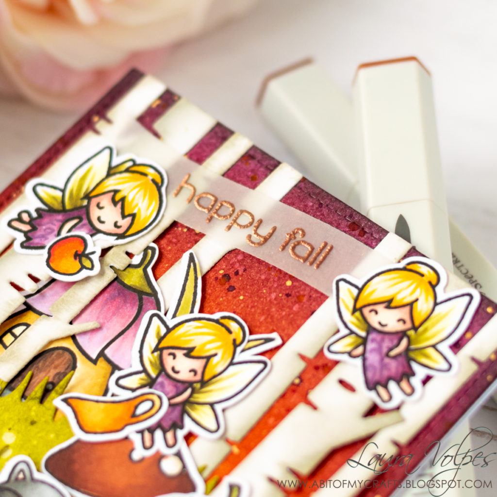
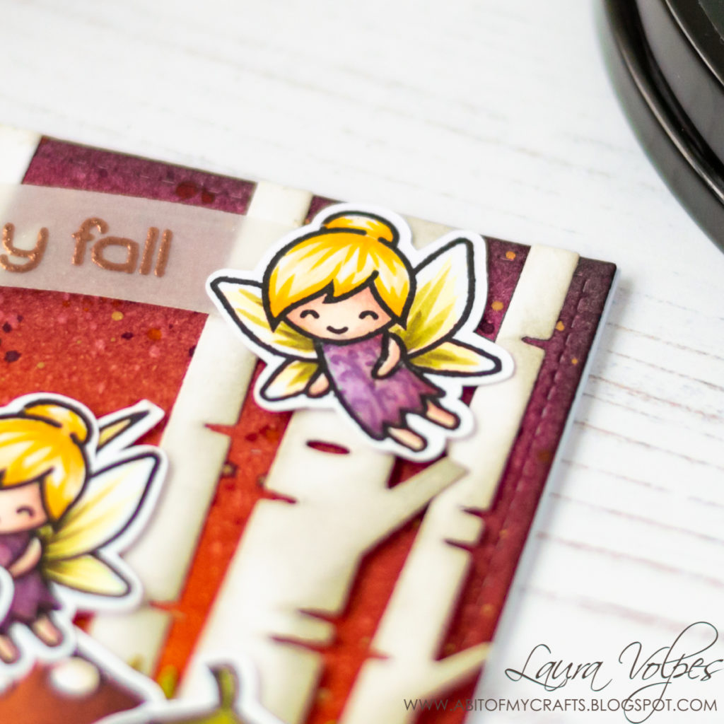
In this scene the fairies form a triangle, the fairy houses do as well, and the animals too (I consider the squirrel on the left and the hedgehog as one element, as it is its own little scene).
The same principle applies to embellishments, if you decide to add any.
3) Tell a Story

A.k.a. make sure that the characters interact with each other and with objects in the scene. This will give your scene a context and create action, even if you are using still images.
That is the trick, in my opinion. When I look at a cute scene with cute stamps and my brain can wander and imagine what is the sweet story behind it, that’s when it goes “aaaaw!”. And that’s when I feel I am looking at a wonderful scene card.
For this card I imagined a woodland feast, with critters and fairies happily celebrating fall together. That’s why the fairies are carrying an apple and the saucer, while the hedgehog and one of the squirrels are preparing a yummy pie. An extra touch of cuteness is added by the second squirrel sitting on a mushroom. How sweet!
4) Create interest with layers

Layers are key in creating depth in your scene. By adding several layers you create different imaginary planes on your card, which give the impression that the scene extends beyond our 2D card front 🙂
Adding foam tape and raising elements that are in the foreground helps too (and it yields a beautiful result). Having said that, you can see in today’s card, it is not essential.
In my scene I added three grassy hills. I made sure to glue elements around every hill, some in front of them, some behind. This way the viewer gets the impression that the different elements sit at different depths in the scene.
5) The Devil is in the Details
I added a wood grain pattern to doors on the fairy houses and some details to their dresses, too.
And that’s it for today! I really hope you enjoyed this post – it’s a bit different from the usual ones you see here. I had a lot of fun creating it (and the card, too!) and I would love to know your thoughts about this format! Let me know in the comments below!
As I said at the beginning of this post, with this card I would like to participate in the Lawn Fawnatics challenge, the Simon Says Stamp IG challenge and, because good things come in three’s, to the Simon Says Stamp Wednesday challenge! 😀 Is that too many? 😉
A big thank you once again for visiting my blog and I wish you a wonderful day!

When possible, affiliated links are used at no additional cost to you. This means that if you make a purchase through one of these links, I will get a small commission at no additional cost to you. The money I earn this way goes towards running this blog and my YouTube channel and allows me to keep sharing inspiration with you. Thank you for your support! 💖


Comments
What a great post – thank you so much for those useful tips!
Author
Thank you! I am very happy you found this useful!
This is such a gorgeous card … and I really loved all your tips!
great card! those little fairies are so cute! thanks a lot for playing with us at Lawn Fawnatics!!