What does it take to make a beautiful handmade card? I surely am someone who doesn’t mind spending hours on a project and including a lot of detail. But sometimes we are in need of something quick and pretty. Does it mean we have to let go of the wow effect?!
Not at all! Here are some tips you can use to step up a simple design!
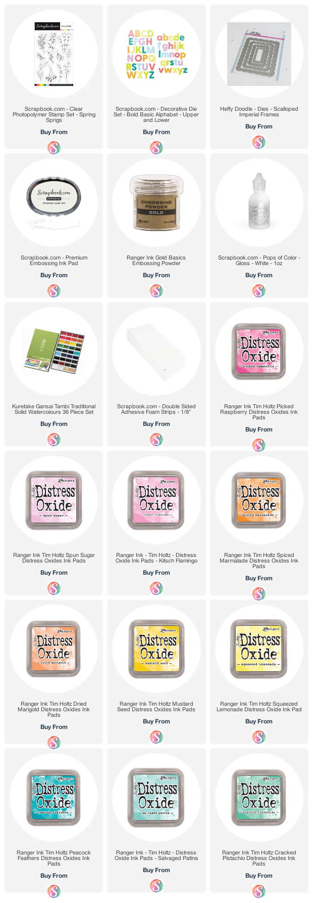
#1: EVERYTHING IS BETTER IN GOLD

Ink blending over heat embossing is fun and quick. And you can easily step it up by using gold embossing powder.
For this background, I used the Spring Sprigs stamp set – really pretty and delicate floral designs that are perfect for an elegant background.

And make sure to add gold to other elements, too: in this case, I added some droplets to my background with metallic watercolor and used gold glitter cardstock for my die-cut letters.

The die set I used is the Bold Basics by Scrapbook.com and is just the right font for this design!
#2: OMBRE IS YOUR FRIEND

Another way to add interest to a background is to blend your inks creating a gradient, rather than going for a flat color. For this one, I used Picked Rasberry, Kitsch Flamingo and Spun Sugar Distress Oxides.
Can you see how this helps the eye move across the design? It makes a big difference! If you keep the lighter colors at the top, you will create sort of an airy effect – it add lightness and makes the card more relaxing to look at for the eye.
#3: PLAY WITH DIMENSION

Raising elements over foam tape is a great way separate them from the rest of the design. For the die cut letters I emphasized the effect even more by creating a drop shadow effect with letters that I had die-cut from white card.

Raising the edge of my scalloped rectangle helps frame the design as well and drives the eye towards the center of the card, where the focal point is. You can see it in the picture below:

Another way to add dimension is to use accents like the Pops of Color.

In this case I used Gloss White to match the color of my card base.
EXTRA TIP: PLAY WITH COLORS

The great thing about a design like this is that you just need to change colors and maybe the sentiment and you have SO MANY POSSIBILITIES for your cards! In the one above I used Cracked Pistachio, Salvaged Patina and Peacock Feathers Distress Oxides….

….and in this last one I used Spiced Marmalade, Dried Marigold, Mustard Seed and Squeezed Lemonade.
And I am in love with every single one of them! So, will you give it a go? 😉

The items marked with a * were sent to me for free for designing purposes. When possible, affiliated links are used at no cost to you. Thank you for your support!